Note: This is a backdated post, originally published in March 2015.
Since joining City AM in June 2014, we’ve introduced a series of gradual changes to the site layout.
The main changes can be grouped into a few areas:
- a new header
- a tiled layout
- getting the homepage and category pages to match
- mobile-first
- a refreshed sidebar with compelling content and greater variety
Barring a few tweaks, the theme has stayed roughly the same.
What did we change, and why did we make those changes?
New header
The previous header was quite compact, but it felt quite claustrophobic – there wasn’t any space for additional categories.

We wanted to incorporate the “Business with personality” tagline, make the subcategories accessible, and show the user their current position within the site. We also had an additional set of links to add to the top. Later, we introduced the “FTSE bar” and trending tags.

As part of the layout changes, we also refined the look and feel. The social icons, search box and the navigation bar were all updated to feel more unified.
Tiled layout
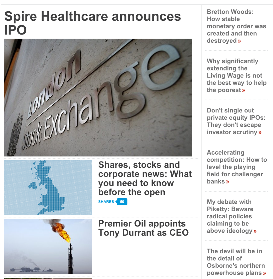
The previous homepage layout incorporated a wide first column containing a lead story with headline and image, followed by an image/headline stream of content. Alongside this was a narrow second column containing text-only headlines of opinion pieces.

This didn’t maximise the available space, and it was quite text-heavy. There were also several design elements we wanted to clean up; namely, the abundance of grey lines, and the double red arrows.
We decided to introduce a tiled layout:

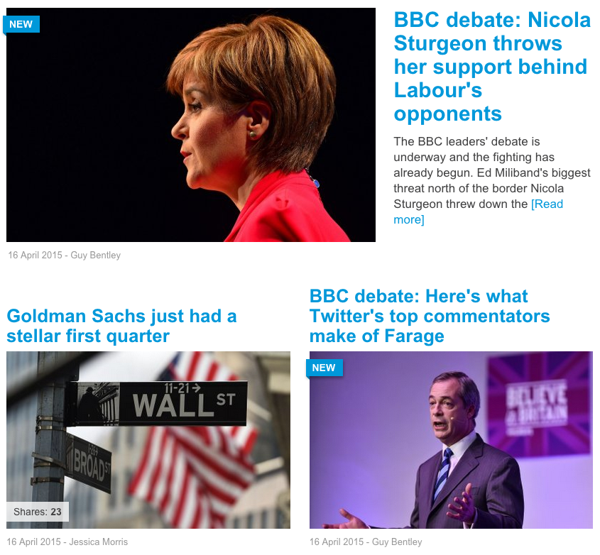
This took a while to get right. The increased emphasis on images brought the page to life, but it has required a greater focus on selecting good images for every story. The introduction of subtle “furniture” helped to differentiate between content pieces; coloured labels such as “New”, “Opinion” and “Shares: xx” draw attention to certain content, while dates and author names add a little more information and also break up the stream.
The lead story was the one place we felt that an intro paragraph and related links could be useful. Links aren’t always used, but the intro always appears. This gives greater focus to the lead story.
Positioning the headlines above or below the images took a few attempts. Having two columns means it’s possible for a long headline to create a lot of whitespace if its neighbour has a very short headline. We debated whether it was better to have space above the headline and keep the headline and image attached, or line up the top of every headline but potentially have space between the headline and image. The former worked better. The result is that there is a certain amount of tweaking that goes on to make the stream balanced – which means no four-line decks alongside one-line decks.
Homepage and category pages
The category pages originally had a different layout to the homepage. Take a look:

We didn’t feel the layout was particularly compelling. So we decided to reuse the tiled layout from the homepage:

This was always the intention – the tiled layout was designed to suit any area. There are slight variations on a few special pages such as topic pages and company pages.
Mobile-first
A major focus throughout the work we did on the tiled layout was to put mobile first. We designed something that looks great on mobile, and scales up to tablet and desktop well.
Leaving out the lead story for space reasons, here’s how it looks on mobile:

I actually prefer it on mobile. This is perhaps my favourite part of the changes we made.
Sidebar
The sidebar is something we’ve changed a bit more than the rest of the layout:
- redesigning the Newsletter signup box;
- adding a “Data in Focus” box;
- reworking the second homepage column into a new sidebar box – “The Forum”;
- added images to “Most Read” and changed this to update more often;
- when you reach the bottom of the sidebar, the ad and the Most Read box stick to the top.
Managing the changes
With so many changes to make, this would have been a big project if we tried to do everything at once. Instead, we took the approach of getting changes live as quickly as possible, so we could monitor any positive or negative effects on overall stats and conversions.
This gradual but steady cycle of changes allowed us to respond quickly when we wanted to make a change. This was essential due to the small development team. When resources are precious, you need to think carefully before jumping into a huge project – especially if it’s not clear if you will see benefits until you actually try it out.
As for the results, they’ve generally gone one of two ways:
- Fail, learn, adapt
- Succeed, learn, grow
Where we’ve seen no difference, we either gather more data or make a further change and monitor that instead.
Sometimes, you have to fail to succeed. As long as you learn, it’s all good.
Further reading
Following these changes, we did a full website redesign in March 2016. You can read about it here: Redesigning City A.M. – March 2016
[…] City AM: Homepage/Category redesign – a look at the last major design changes we made back in March 2015. A good comparison to the redesign we launched a year later – and also a look back at the design prior to that. […]